Responsive Website Design
Why you need a responsive website
Over 97 percent of consumers now go online to find a local business. With 80 percent of these using a smartphone to look-up products and information it’s crucial that your website is responsive.
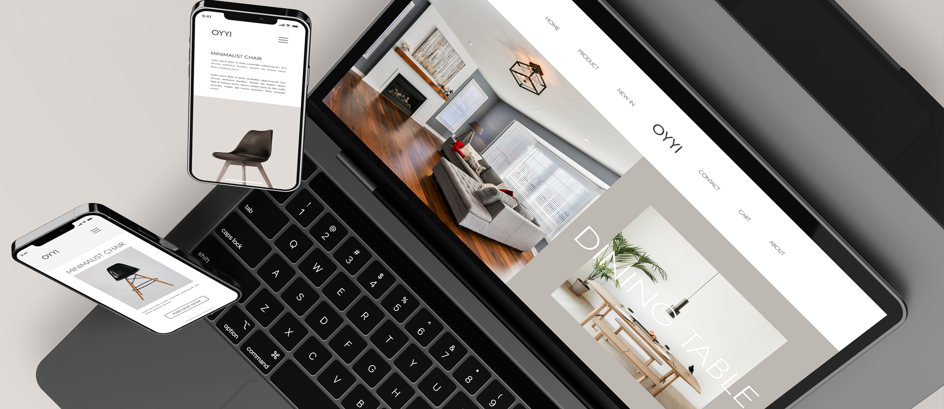
What is a Responsive Website?
Put simply, your website should automatically adapt to fit the screen size of a mobile device. A desktop screen is nice and big, allowing your website to show lots of information. Photos and text in one place. If you then view that website on a mobile phone you suddenly notice that the screen is much smaller. This is when your website automatically detects the new screen size and adapts it’s design to be fit. Menu’s are smaller, photos and text stack above one another. Vertical scrolling. Instantly making the whole user experience much friendlier – no pinching or horizontal scrolling required. This same responsiveness works on tablets, shrinking the website content to fit the screen.
As you can see, there are various benefits to your business in having a responsive web design. If your website isn’t yet responsive just get in touch and we’ll be happy to help.
5 Advantages of a Responsive Website
1. Improved User Experience
Provides a seamless user experience between desktop and mobile
2. An Increase in Mobile Traffic
Increasing your reach to tablet and mobile audiences
3. More Social Sharing
Users are more likely to share mobile content
4. Higher Conversion Rates
Increase your visibility in search engines
5. Better Website Loading Times
Responsive websites tend to load faster on all devices

A Responsive and Mobile-Friendly Website
Being responsive is just one aspect to having a mobile-friendly website. If you’re not optimizing your content for mobile users, you’re missing out on traffic (and wasting some of your current traffic). That means that the text is easily readable, links and navigation are easily clickable, and it’s easy to consume the content in general.
If you want to check whether your website is mobile friendly then Google has it’s own Mobile-friendly test tool.
Mobile-Friendliness and SEO
Mobile usability is the third most important factor for Google when deciding on how to rank your website. This means that you will rank lower against your competitors if you don’t have a mobile-friendly website.
Mobile-Friendly Content
Mobile users need to navigate quickly and easily around your website. On smaller screens text also becomes very important. Content needs to be concise, direct and readable and calls-to-action easy to find.

Responsive Web Design
On a mobile device or smartphone a responsive website is crucial to enhancing a visitors experience. If your website is easy to use it will reflect positively on your business and convince users to return.

Let’s talk about making your website responsive
If you’re interested in getting new customers (and keeping the ones you already have), then you need a mobile-friendly website design. Get in touch and we can have a chat about your website project. Just give us a call on 0776 5060788 or simply email us.